At the start of 2024, the Financial Times launched a six-part personal finance email course authored by consumer editor Claer Barrett. The course was designed to help people gain more control over their money by breaking down complex financial topics into simple, practical steps. Delivered as a weekly email series, the course covered areas like budgeting, tax, investing, and managing money within relationships.
This was a new type of product for the FT. Existing subscribers could access it for free, while non-subscribers were offered the full course plus eight weeks of FT access for a one-time fee of £19. The goal was to create an experience that served as both a value-add for current subscribers and an entry-point for new users. The course also tested whether structured, editorial-led content could drive acquisition and retention outside the traditional subscription model.
Research & Insights
Early in the planning phase, we ran research to better understand audience needs around personal finance. Interviews and surveys revealed that many users wanted help with money management but didn’t know where to start. They often found financial information overwhelming and perceived the FT’s content as credible but too advanced.
We found a clear appetite for beginner-friendly, time-limited content with a strong guiding voice. Users were drawn to the idea of a course they could complete at their own pace, with clear outcomes and no pressure. A trusted expert like Claer Barrett gave the offer additional appeal. This feedback directly informed the tone of the course, the one-off pricing model, and the overall structure of the journey.
The Challenge
The experience needed to adapt to three different user types: FT subscribers, registered users, and anonymous visitors. Each group had a different relationship with the brand, and therefore needed a tailored journey. Subscribers had to be onboarded with minimal friction. Registered users needed to be nudged into converting. Anonymous users had to register, pay, and activate their course journey without confusion or delay.
All of this had to be designed within the technical limitations of existing systems, including Bloomreach (for email logic), the FT’s core account infrastructure, and the Zuora-based payment platform. The UX had to support dynamic paths, offer reassurance, and maintain clarity across all devices.
Planning & exploration
As the UX designer, I began by mapping out user journeys for each audience type. I created multiple flow variants to understand how login states, CTA logic, and email triggers would need to shift. This phase also helped us identify moments of potential friction, particularly around the payment and onboarding process for new users.
I produced early-stage wireframes for landing pages, confirmation screens, and onboarding moments. These allowed us to explore layout, hierarchy, and content density before committing to high-fidelity designs. I also collaborated closely with the CRM and product teams to define key logic for license application and email sequencing.
References
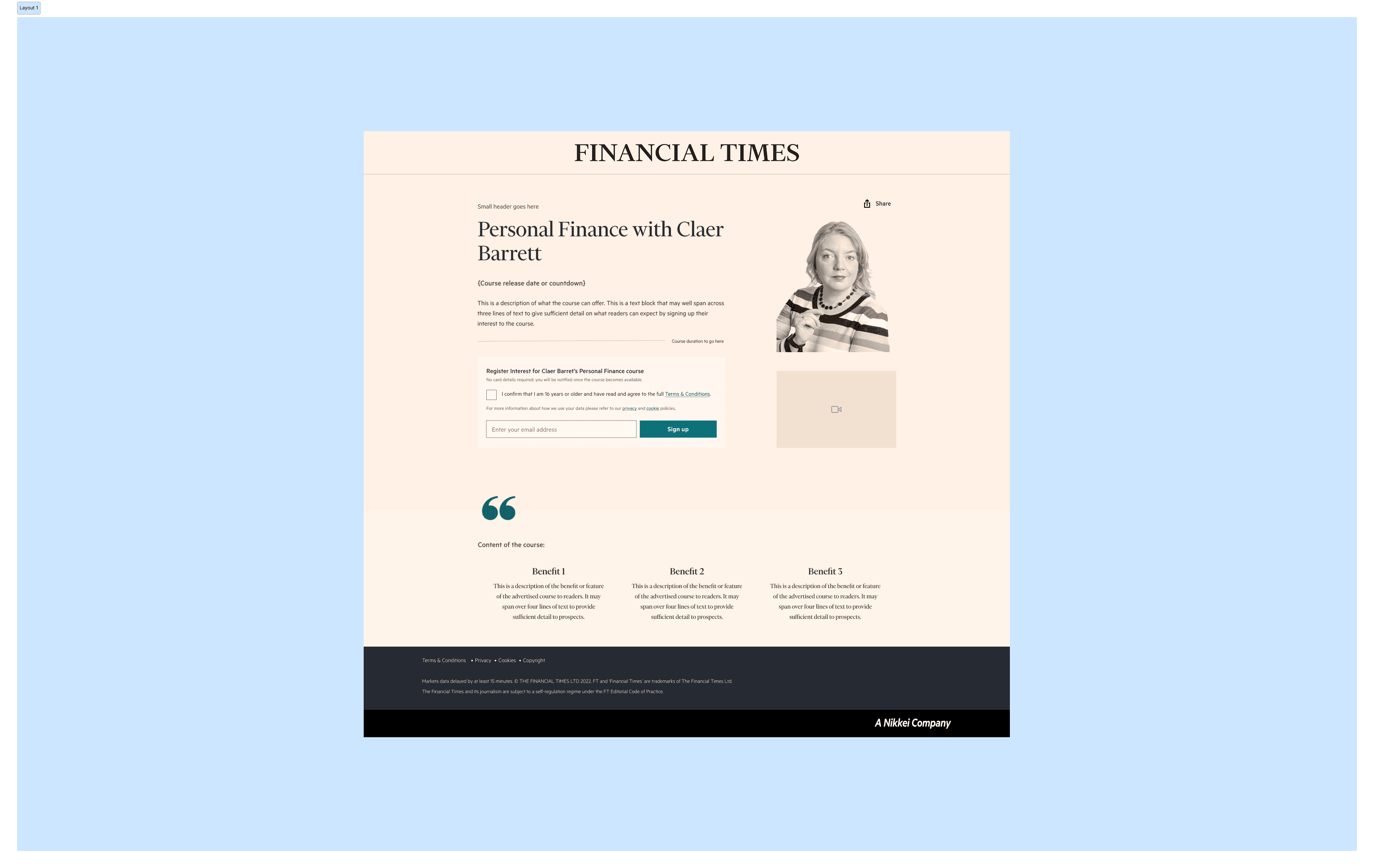
Wireframing Layout 1
This version follows a similar layout to the Niche Newsletter, based on Andy’s current progress. The imagery used is purely illustrative, intended to give a sense of the kind of visuals we might include. The layout is flexible and can be adjusted depending on the priority of the video content. If needed, the video can sit in its own dedicated section to give it more prominence and focus.
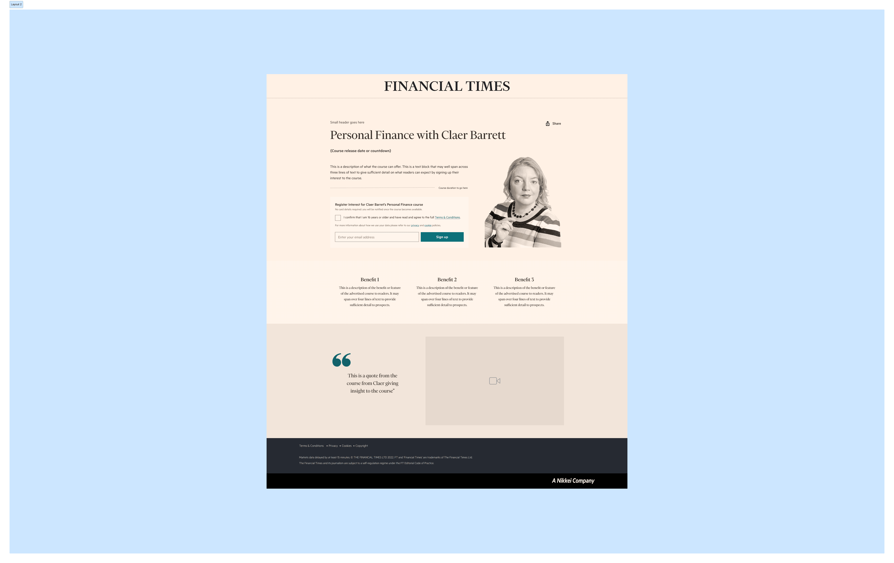
Wireframing Layout 2
There’s a stronger visual emphasis on Claer, with increased breathing space around each element to improve clarity and balance. The video is given its own section, which includes a supporting quote to highlight a key message and draw attention visually. The entire design is built using auto-layout sections, making it easy to rearrange the order of slices based on content hierarchy and team needs.
Wireframing Layout 3
In this version, the video has been moved higher in the layout to give it greater prominence. The positioning of slices and individual elements, in my view, should ultimately be guided by the strength and amount of available content. Prioritising key assets like the video helps ensure the layout reflects the most compelling parts of the story.

Wireframing Mobile

Designing the experience
Two core landing pages were created: one for pre-registration before launch, and one for sign-up once the course went live. Both pages clearly explained what the course included, how it worked, and what users could expect. Depending on the user’s login state, the CTA would adapt to trigger the right next step—sign-up, payment, or confirmation.
I designed the confirmation screens, onboarding messages, and welcome email, focusing on reducing cognitive effort and setting clear expectations. Once users enrolled, they received six weekly emails with practical advice, quizzes, links to additional FT content, and optional tasks. The tone was designed to feel approachable and encouraging rather than didactic or formal.
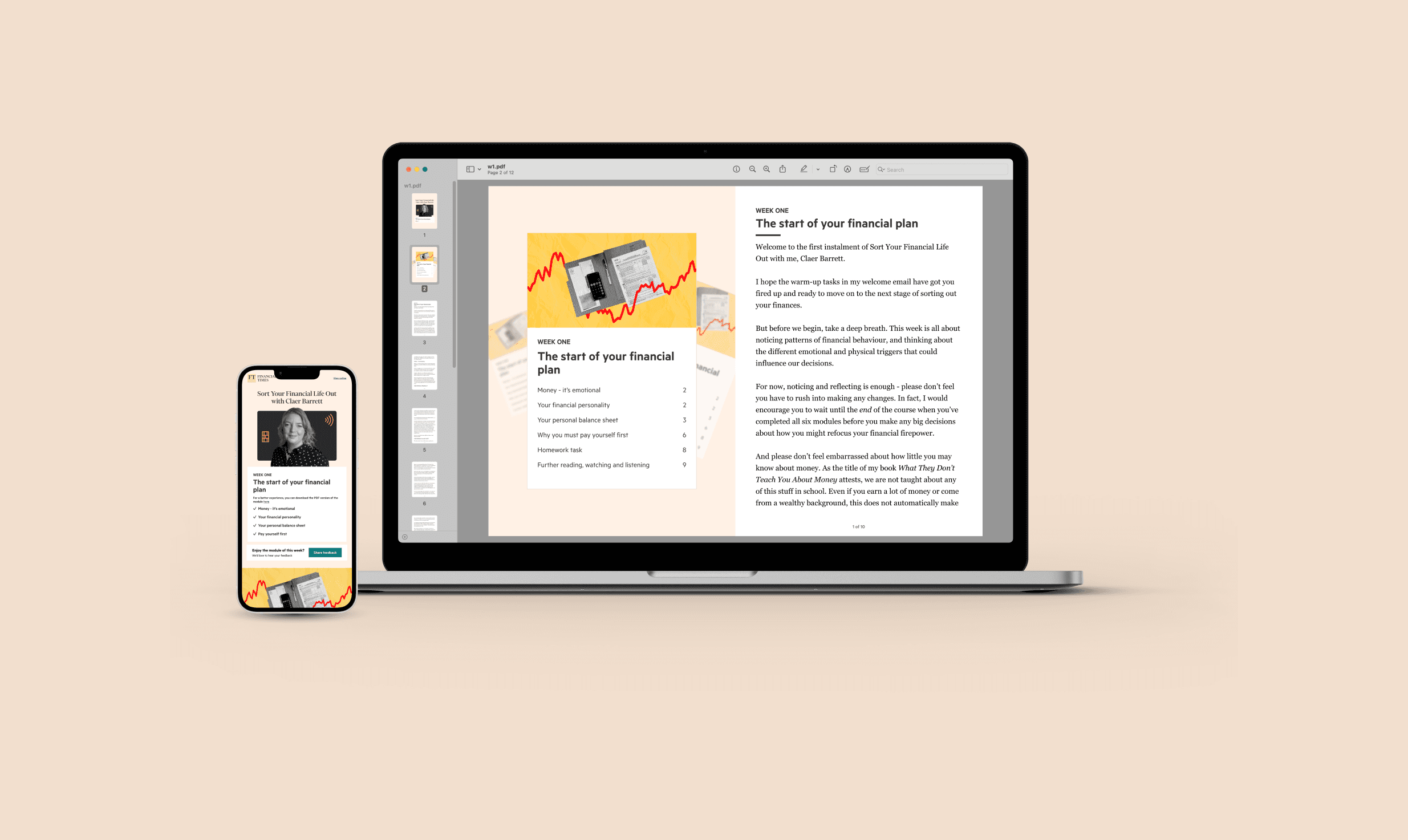
Users also received a downloadable balance sheet PDF via the welcome email and confirmation screen. This offered immediate value and gave the experience a tangible starting point.
Pre registration

Launch

Journey & buy flow
Our solution was a structured user journey that adapted based on the user’s status (subscriber, registered, or anonymous) and guided them toward one of two outcomes: completing the course or subscribing to the FT.
Subscribers could sign up in one click, with emails delivered weekly starting the following Wednesday.
Registered users were prompted to pay for the course after receiving an email when it launched.
Anonymous users were nudged to register and then follow the same purchase flow.
The course was delivered over email using Bloomreach and tagged by license logic, ensuring only eligible users received content. Users also had access to a downloadable PDF balance sheet and quizzes throughout the course, increasing interactivity.


Weekly Emails & PDF
Each weekly module (email) was accompanied by a downloadable PDF, designed to deepen the learning experience and offer users a clean, focused space to engage with the topic offline. These were built to support the themes introduced in each email—such as budgeting, tax, or investment—and included worksheets, prompts, and simple frameworks to apply personally.
Visually, the PDFs were intentionally stripped back. The layout was clean and open, using clear typographic hierarchy and soft FT brand colours. I designed them to feel approachable and easy to print or view on any device. Each one followed a consistent structure: an introduction from Claer, an actionable exercise or worksheet, and a space for reflection.
This consistency helped build familiarity over the six weeks, while the content evolved to match increasing complexity. Importantly, the PDFs were never overwhelming—one or two pages each, clearly focused, and designed to feel achievable within 15–20 minutes.
These assets played a crucial role in making the course feel tangible. They encouraged deeper engagement and reinforced the FT’s role not just as a source of information, but as a helpful guide through financial decision-making.
Downloadable PDF
Email Drafts

Final email template
Mesuring Success
To evaluate the performance of the course, we designed a measurement framework that combined behavioural data, conversion tracking, and qualitative feedback. Our aim wasn’t just to count sign-ups — it was to understand how users engaged with the course, what value they perceived, and how effectively the experience converted curiosity into subscription intent.
Key Metrics
We tracked four core performance areas:
Sign-ups
We measured total course enrolments, segmented by user type (subscriber, registered user, anonymous), and mapped against campaign efforts. This told us which channels and landing pages were most effective at driving interest.Conversion Rate
For non-subscribers, we monitored conversion from landing page visit to payment. We also tracked how many course participants transitioned into full FT subscribers after their eight-week access period ended.Engagement
Using email analytics and internal dashboards, we tracked open and click-through rates for each module. We monitored which content sections (e.g. quizzes, homework, FT article links) users interacted with the most, as well as unsubscribes and drop-off points.Retention & Subscription Uptake
Post-course, we observed whether users took up subscription offers delivered in the final email. We also tracked retention behaviours during the 8-week access window — including logins, article reads, newsletter sign-ups, and podcast engagement.
My Role
As the UX designer on this project, I was responsible for shaping the user experience from concept through to launch. This involved a blend of discovery, flow mapping, interface design, and content collaboration — all centred around delivering a seamless, approachable journey that met the needs of multiple user types.
Discovery & Planning
In the earliest stages, I helped interpret research findings into actionable design goals. I mapped out user motivations and anxieties, and created early concepts for how we could guide users through a new type of product — one that blended editorial content with access gating, email automation, and conversion mechanics.
I worked closely with product managers and other stakeholders to define requirements and constraints. I created detailed user flows covering different states (subscriber, registered, anonymous) and helped validate them through internal testing and prototyping.
Design
I designed wireframes and high-fidelity prototypes for:
Pre-registration and sign-up landing pages
Purchase confirmation and onboarding moments
Email modules and course structure
PDF weekly courses
Survey placements and unsubscribe UX
Each element was designed with tone, reassurance, and momentum in mind, helping users feel guided, not sold to. I also reviewed past FT onboarding flows to understand what visual and structural patterns were already familiar to our audience.
Content & Interface Collaboration
Given the editorial nature of the product, I worked closely with Claer Barrett and the newsletter team to structure and format email content in a way that enhanced usability. I provided design input on copy length, link formatting, quiz structure, and call-to-action placement across all modules.
This project reinforced the value of structured, empathetic onboarding. Even a relatively simple product like an email course benefits from careful attention to tone, access logic, and user reassurance. Designing for three user types at once challenged me to think beyond the happy path and ensure every possible entry point was frictionless.
One thing I would do differently is build more real-time user testing into the early sign-up flows. While internal QA was thorough, observing actual users interact with the landing pages and confirmation flows would have helped surface small copy or timing confusions earlier.
I’d also advocate for modularity in future versions of the course. Giving users the ability to skip or revisit modules, or choose from more personalised tracks (e.g. self-employed, joint finances, international tax), could add value without compromising simplicity.
Looking ahead, I’m interested in how this format could scale into other editorial verticals or become part of a retention toolkit. This case was a strong proof of concept for course-based acquisition, and I’d be keen to refine and expand on what we learned.