As the Financial Times expanded its product range, from core subscriptions to more specialised apps, it became clear that a consistent way of presenting these products was missing. Each one had its own look and feel, which made it harder to maintain a cohesive brand experience across channels.
To solve this, we developed the FT Consumer Marketing Style Guide. It brought together the rules for how FT products should appear in marketing, both online and in print. This went beyond logos and colours. It covered how to show devices, how to use gradients and motion, and how to write and design for things like product pages, ads, and promotional imagery.
I led the work on UX messaging, product content structure, and the language used to guide design. My focus was on making sure:
Designers and marketers could clearly represent any FT product, in any context
The visual and UX patterns stayed consistent across platforms
Every layout told a clear story that reflected the product and the wider FT brand
My Role
I was responsible for the full content design of the FT Consumer Marketing Style Guide. That meant shaping the overall structure, writing all the instructional content, and making sure every section was clear, consistent, and usable. As lead UX content strategist, I created a writing system that covered everything from how to show device interfaces and use motion, to how content should be presented and how the brand’s tone should come across.
To keep things accurate and aligned, I worked closely with teams across brand, product, and creative. We reviewed existing assets, identified where things had drifted or become inefficient, and used those insights to define best practices that could scale across channels. The result was a guide grounded in FT’s editorial values and digital standards.
I also played a key role connecting visual design with product strategy. Part of my job was translating big-picture brand principles into clear, actionable UX guidance—guidance that balanced visual consistency with real user needs.
The Challenge
With more than seven products, multiple core platforms, and a mix of internal and agency teams, the FT needed a consistent visual and messaging approach. One that could bring everything together without erasing what made each product distinct.
The main challenges included:
Inconsistent visuals: Packshots differed in layout, cropping, colour treatment, and UI styling from team to team
Brand dilution: FT Pink was often misused or overapplied, weakening its overall impact
No device standards: Elements like shadows, corner radius, and UI placement weren’t defined, creating visual clutter
Too much guesswork: Designers were left to interpret tone, style, and UX conventions on their own
Cross-functional friction: Teams across design, marketing, and development lacked a shared reference point
The solution had to be modular, practical, and scalable—something designers, marketers, developers, and even external agencies could use without needing deep familiarity with the FT brand.

Research & Insights
Before writing the guide, I carried out a detailed audit across teams and channels. This included reviewing how product imagery was being used in emails, social media, app stores, and display ads, as well as digging into internal campaign files, vendor briefs, brand guidelines, and UI documentation. I also looked at platform-specific constraints like Meta’s creative requirements and Google’s device frame policies.
Some of the key insights included:
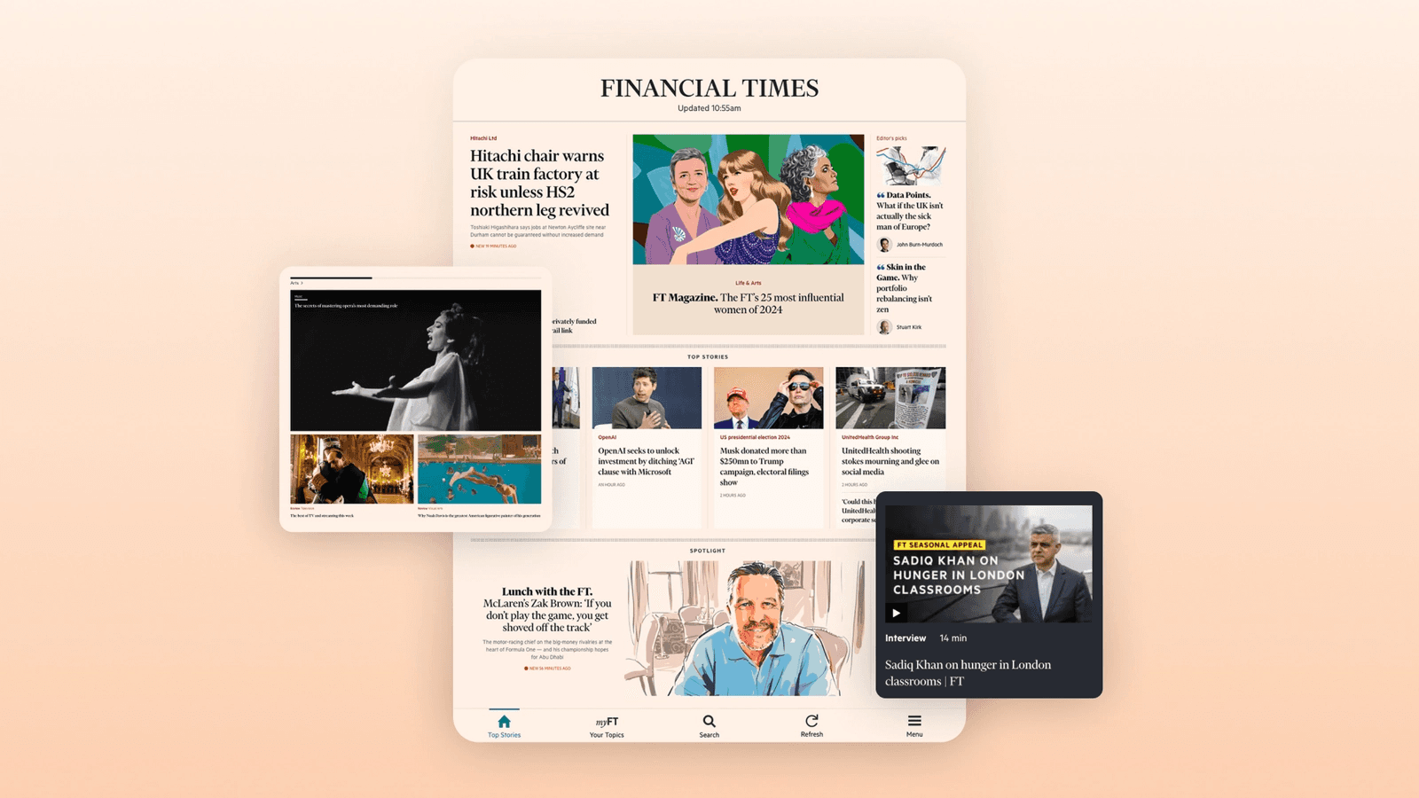
Standard Digital users mostly accessed the FT on tablets, yet marketing visuals often showed phones
Premium and Standard Digital looked visually identical in most marketing, despite offering different experiences and targeting different audiences
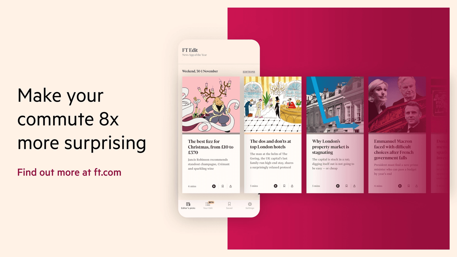
FT Edit needed a bolder, more distinct visual identity to appeal to its younger, mobile-first audience
Visual elements like gradients, shadows, and animation lacked consistency, sometimes creating clutter or weakening the brand
Designers wanted clear, flexible rules rather than overly rigid templates
I also gathered behavioural and audience insights to help shape the tone and messaging:
Different segments responded to different benefits—some valued credibility, others independence or status
Tone needed to shift depending on seniority, sector, and reading preferences
There were signs of product confusion and message fatigue in key channels
Emotional cues like confidence, empowerment, and discovery resonated more than generic selling points
Solution: Messaging Framework Design
To bring consistency across FT’s growing product ecosystem, I designed a modular structure for the style guide. It could flex across all products while staying rooted in a shared design language. Each section followed a repeatable format with clear, practical rules that balanced brand consistency with product-level storytelling.
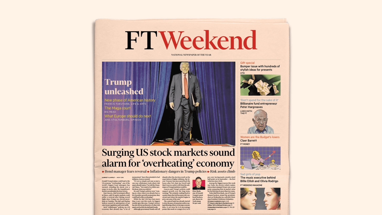
I wrote tailored content guidance that highlighted which features to prioritise for each product. For example: Lex and premium newsletters for FT Premium, curated daily reads for FT Edit, and print-style layouts for the Digital Edition. This helped teams focus on what mattered most for each audience.
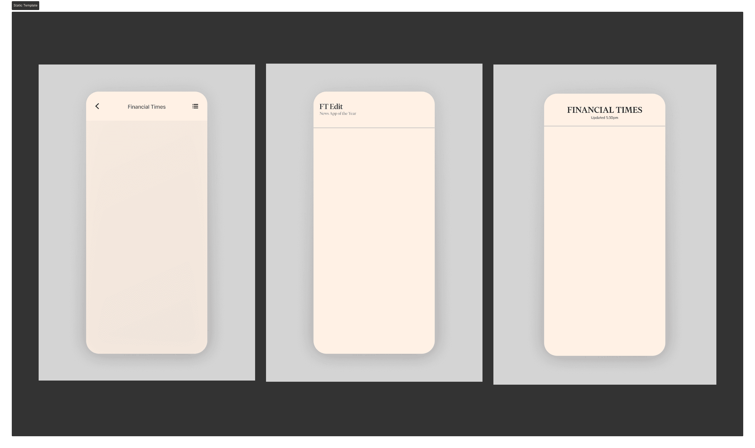
I also created a display strategy for device imagery, based on how different audiences actually engaged with FT products. Desktop for Premium users, tablet for Standard, and mobile for app-based products like Edit. To avoid clutter and maintain visual hierarchy, I introduced layout principles that simplified composition and focused attention where it mattered.
The guide included a full colour system, with HEX, CMYK, and Pantone values, along with clear advice on using gradients with restraint. I defined motion principles using straightforward language, explaining when to use a swipe gesture, when to animate a tile, and when a scroll prompt adds value. Typography and CTA guidance covered headline casing, button tone, and where to place calls to action within a layout. Even details like corner radius and shadow scaling were addressed to maintain visual depth without distraction across devices.
Each product section ended with visual examples of what to do and what to avoid. This helped teams spot common mistakes and apply the standards with confidence. The result was a system that preserved each product’s identity while reinforcing the clarity, authority, and polish that define the FT brand.
Visual Guidelines
To support the visual guidance, I paired each section with clear, purposeful UX writing that explained not just what to do, but why it mattered. Every line was designed to be quick to read, easy to apply, and consistent with the FT’s editorial tone and design values.
For instance, I described FT Pink as “a signal of trust and heritage, never just another colour in the palette” to help teams use it intentionally. In the packshot section, I recommended using a single-device layout to keep the focus sharp and uncluttered. For UI imagery, I suggested removing OS icons like battery indicators and time displays to keep attention on the FT interface. And for Premium assets, I introduced a soft black-to-slate gradient to evoke depth and a sense of luxury, without competing with the content.
These micro-guidelines were built directly into the toolkit and often sat alongside annotated visuals, like the shadow examples shown below. This made the guidance instantly usable and easier to apply across teams.
Impact
This project is already making a measurable and lasting impact across FT’s marketing and product communications.
Product visuals now follow a consistent set of visual and messaging standards across more than seven subscription types
External agencies and new team members can onboard faster, with a clear system to follow
Design and marketing teams work more efficiently thanks to well-defined layout and content guidelines
Branding is stronger and more consistent, with elements like FT Pink and typography used with greater intention
Collaboration between product, design, and marketing has improved, as teams now share a common visual and verbal foundation
The style guide has become the go-to reference for product marketing at the FT, helping ensure consistency across global campaigns, whether paid, owned, or earned.
Learnings & Reflections
This project was a clear reminder of how closely content, UX, and design systems are connected. A brand’s identity isn’t just about colours or logos. It’s about how those elements are explained, applied, and repeated across every touchpoint. Small visual choices can have a big impact on trust, recognition, and conversion.
A few key lessons stood out:
Systems only work if they scale. If a rule doesn’t hold up across devices, it won’t hold up at all
UX writing needs to communicate the reasoning behind choices, not just the rules themselves
A good style guide gives teams clarity and confidence. It doesn’t box them in
Voice and visuals work together. If one feels off, the whole experience suffers
By translating abstract brand principles into clear, actionable UX guidance, we built a system that helps teams move faster, stay aligned, and uphold the quality users expect from the FT across any platform or campaign.
(Some) Designs